Layout Critique #2
This week's layout come from Melouise. It's rather nice I think, but there were some things she wasn't happy with. I don't want to influence your opinions by telling you what they are, so take a look and let her know what you think!
Please follow the directions carefully. Be specific and make a "good feeling sandwich" (something you like, something you'd improve, something you like). Comments that do not follow the guidelines may be deleted.
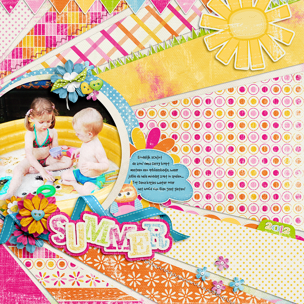
I'm hoping to make this a regular feature on the blog. If you'd like to submit a layout for critique please email it to me at [email protected]
Blog By

Subscribe to this blog
![]()
![]()
My Projects


Follow Marisa Lerin
Monthly archive
- November 2012 (9)
- December 2012 (37)
- January 2013 (17)
- February 2013 (13)
- March 2013 (20)
- April 2013 (26)
- May 2013 (29)
- June 2013 (9)
- July 2013 (8)
- August 2013 (13)
- September 2013 (16)
- October 2013 (14)
- November 2013 (16)
- December 2013 (12)
- January 2014 (15)
- February 2014 (9)
- March 2014 (15)
- April 2014 (11)
- May 2014 (4)
- June 2014 (9)
- July 2014 (8)
- August 2014 (7)
- September 2014 (8)
- October 2014 (13)
- November 2014 (6)
- December 2014 (3)
- January 2015 (13)
- February 2015 (14)
- March 2015 (14)
- April 2015 (13)
- May 2015 (12)
- June 2015 (11)
- July 2015 (10)
- August 2015 (8)
- September 2015 (7)
- October 2015 (10)
- November 2015 (8)
- December 2015 (10)
- January 2016 (7)
- February 2016 (6)
- March 2016 (8)
- April 2016 (7)
- May 2016 (8)
- June 2016 (8)
- July 2016 (6)
- August 2016 (5)
- September 2016 (8)
- October 2016 (8)
- November 2016 (11)
- December 2016 (7)
- January 2017 (6)
- February 2017 (12)
- March 2017 (10)
- April 2017 (7)
- May 2017 (9)
- June 2017 (9)
- July 2017 (10)
- August 2017 (7)
- September 2017 (11)
- October 2017 (8)
- November 2017 (9)
- December 2017 (8)
- January 2018 (8)
- February 2018 (8)
- March 2018 (8)
- April 2018 (4)
- May 2018 (9)
- June 2018 (9)
- July 2018 (4)
- August 2018 (5)
- September 2018 (13)
- October 2018 (19)
- November 2018 (18)
- December 2018 (14)
- January 2019 (23)
- February 2019 (20)
- March 2019 (17)
- April 2019 (14)
- May 2019 (17)
- June 2019 (14)
- July 2019 (8)
- August 2019 (3)
- September 2019 (14)
- October 2019 (17)
- November 2019 (16)
- December 2019 (6)
- January 2020 (14)
- February 2020 (20)
- March 2020 (16)
- April 2020 (18)
- May 2020 (19)
- June 2020 (16)
- July 2020 (8)
- August 2020 (5)
- September 2020 (8)
- October 2020 (10)
- November 2020 (10)
- December 2020 (7)
- January 2021 (4)
- February 2021 (9)
- March 2021 (8)
- April 2021 (7)
- May 2021 (7)
- June 2021 (7)
- July 2021 (10)
- August 2021 (7)
- September 2021 (8)
- October 2021 (5)
- November 2021 (7)
- December 2021 (6)
- January 2022 (5)
- February 2022 (7)
- March 2022 (9)
- April 2022 (6)
- May 2022 (7)
- June 2022 (4)
- July 2022 (2)
- August 2022 (1)
- September 2022 (3)
- October 2022 (6)
- November 2022 (4)
- December 2022 (6)
- January 2023 (4)
- February 2023 (5)
- March 2023 (6)
- April 2023 (5)
- May 2023 (5)
- June 2023 (5)
- July 2023 (5)
- August 2023 (5)
- September 2023 (5)
- October 2023 (4)
- November 2023 (4)
- December 2023 (5)
- January 2024 (4)
- February 2024 (5)
- March 2024 (5)
- April 2024 (3)
- May 2024 (2)
Recent Comments
I love the sunburst effect, with the "relief" of the biege paper in between to give a little rest from the colorful papers. Also love the distressed lettering!
I really love the bright cheerful summer colors. I would have made the writing a bit bigger to be easier to read. Great embellishments used as well! And really liking the layout that reminds you of the sun!
I love the way you made rays and put little bits of interest on the edges of them. The 2012 tab is so sassy. I look at this and I see a picture that may not have turned out good, or you edited it to match the papers. Which ever reason doesn't really matter to me because you pulled it all together in the end. The only way I could see improving on this is maybe a color behind the rays so they would show up better. I would be happy to have a good layout like this is my albums.
I am a new scrapper, so I don't think I could pick out anything that she should change, I love the entire layout! However, I love reading the other comments, it helps me to see things I wouldn't have seen, even if I tried!
Overall...I LOVE IT! Colors, cheerful! Layout, fun! Picture, adorable! Texture, yes! It's busy and that's great! My only suggestion is to make the blue cloud larger so that you can read the text with ease. Maybe move it to the sun...
Again, you did a great job. Excellent work. Be proud of yourself. :) Thanks for being so brave to take critique...I could never. :)
es muy llamativo y perfecto para verano, aunque para mi gusto está un poco recargado.
un saludo.
As usual, what a lovely design - I love the different papers and the white space between them, like the rays of the sun. The bright colors could perhaps be muted a little, in order to make your photo stand out more. As they are now, they slightly overpower the photo. I have no other suggestions, because this is a great design, I love the clusters, you've added a date, and that "Summer" alpha sets a very fun tone.
I like the way you use different papers for your rays. All the colors come together in the photo.
I think I would have use a bigger font size for the journaling. it belongs to the page, so why not show it off more.
Love the stamped alpha.
You did a great job!
I love the colors you have used and the theme of rays reflecting from the picture, but I wonder what just a couple of rays and to enlarge the photo as it gets a little lost in the layout. Also wondering what a black and white photo would look like and let the viewer imagine the colors. Interesting detail.
I agree with what most people are saying. I love the colours you chose and the sunshine layout. I feel that the colours are too similar to the photo so it just blends in to the page and doesn't pop the way it should. Maybe adjust the colouring of the picture or dull the rest of the page and brighten the blue frame to help draw attention.
I absolutely love the bright sunshine feel of the layout as well as the vibrant colors. Along with that, I think you did a great job with the shadowing of the elements and papers.
The thing that stands out most to me is that there's lots going on in the layout (something that I frequently don in my layouts as well). To help focus the eye on your adorable picture/journaling, I think I would change out a couple of the patterned background 'ray' papers with a more solid color paper. If you didn't want to do that, another option may be to increase the size of the picture/frame/embellishments on around the frame/journaling. Or, if you didn't want to do that either, you could maybe decrease the opacity of the background papers...again to help draw the eye to your photo/journaling.
I go back and forth as to whether I would possibly mess with the levels/brightness/contrast/saturation on the picture. The skin of the kiddos looks slightly washed out. If I were to do it, I would do it by hand vs. a global change to the whole photo. That said, it would be such a minor change that it may not be worth the time.
All in all I love this layout. It is completely my style and something that I'd love to scraplift in the future. Thanks for being willing to put your work out there.
I love the way the various papers reflect as rays of sunshine. I feel like the picture and the wording get a little bit lost in the business of the layout. I love all of the hidden surprises as you look at the details of the layout. Great idea!
I think it is beautiful too. One thing I would do is maybe adjust the photo a bit. Make it somehow darker. Maybe add some extra shadow to the circle part around the photo on the outside to make it stand out a bit.
I think Melouise did a very great job!! I love the layout. It is very colourful and vibriant. What I should change is that I would use less patterns for the rays but stick to all those colours so it's more solid and not so noisy. And I would make the text in the cloud bigger because that is a very nice idea! And I love how all the colours match with the picture, very sunny and bright.
And....I think Melouise was very brave to put her layout here so we all can give critique!!
Goed gedaan meid!!
As everyone else said, I love the vibrant colors. The layout feels so sunny and happy just because of the colors. I love the clustering around the photo; it makes me feel drawn toward the photo.
I think what I would change would be the different patterns on the strips of paper. My eyes feel super distracted. I love the way the paper mimics the suns rays, and I think if they were one pattern we would be even more drawn into the photo, yet still get that sunshine feel. That being said I also like all of the little hidden surprises inside/by the strips of paper, the stitching, the flowers, the scallops, grass, etc.. I agree with Lorien's comment that the grass and the scallop should be switched. But I think those little details make it special without distracting they eye too much (if the strips of paper are all the same pattern. My vote is the white paper with yellow polka dots. ;-)
Two last nit-picky things I would do, would be to keep the owl behind the ribbon, but in front of the frame around your pic. The last thing I would do is take out the sun element. It is really cute, but you've already made your own sun, and the little sun draws our eye away from it.
I actually really like contrast in the photo. It makes the colors your kids are wearing really bright without distracting from them. I love the overall design of the layout, I would also like to scraplift this layout someday!
I really love your layout! Love the vibrant colors you used & how well they compliment the picture - it makes your photo "pop."
I'm not sure what you would need to do to improve the LO, because I like it the way it is, but here's a few changes I might make if it were my LO: Remove the 2 stitches (they seem out of place). Break up the one big diagonal slice & replace it with two diagonals (maybe you could make the dotted diagonal narrower, and then make another diagonal slice out of a grungy solid paper that's similar to the yellow one, in either orange or pink, and put that underneath the dotted diagonal slice). I would probably move the banner & place it under "summer," making it part of the cluster. Same thing with the grass graphic... I would probably remove the the small flowers at the bottom of the page since there are a lot of elements on your LO; and I might move or eliminate the 2012 tab (maybe you could put the 2012 tab with the small flower cluster at the top of the photo? or you could put "2012" in your journaling cloud instead). If your plan was to have your whole LO look like a sun, you might want to change the angles of your diagonal slices so they look like sunbeams coming out of the sun (the "sun" being your framed photo).
Forgot to mention - I also love the patterned papers you used & your clustering... I'm not very good at clustering, and you did a great job with that... Overall, your LO is pretty & very cheerful.
layout is really great and full of joy. I love the sun rays, sun and alphabet so much. they are really look lovely. and colors are really nice too. the idea of to turn the circle clustered photo to sun itself really nice and I love it too. Maybe a couple of things I can change about the layout. at first, I wish to use the banner a bit more long. It can go on under the sun till the page end. Second is the black background of the photo. Why is it black? With black I thought there is something wrong. Children say me that it is the midday but the photo lied them and says it's midnight. Which one is right? Remove the darkside of the photo can really help. And a couple of little things more: The flowers under the children's photo makes them stucked a bit. I like them but I think they catch the focus before the photo. Especially orange one. Maybe use the big sun on the right top instead of flowers can help. And you should help that little owlie and save it. It just needs to place forward instead of back of cluster) The last thing is about the sun rays. At first sight, I thought they cut wrong. They don't look like symetric. And if the photo is a sun (maybe you didn't think that but I love to think children are sun) sun rays comes with wrong angles I think. That's all. But without any change, the layout will be great too. It's really nice already and doesn't need a major change. I love every piece of layout and also that journal cloud :)
-I love the harmony of all the different patterns - all different but working together because of what they have in common, tone and texture. I think the blue is the perfect pop of color for the pinks and oranges.
-I think an illustrated flower (maybe even with a bit of distressing like the orange/white flowered paper and word art "Summer) rather than a realistic silk flower would be a nice repeating element. My eye tends to want to go to those flowers rather than past them to the sweet sweet picture of tho kiddos.
- I love the off center focus of the composition and the little hidden surprises as you look around the edges- the 2012, the stitching and the tiny flowers.
Beautifully done - unexpected composition, cheerful colors and lots of textures and elements to make you want to linger.
I think your LO is gorgeous! I love the way the slanted papers point to your focal point, your adorable photo! I also love your clustering, your lovely title work, and the color combination! The only minor change I might make is to make the owl appear on top of your round frame...and maybe place those little flowers further apart on your LO. Really an awesome LO!
You know... I really like this layout! It is so bright and colorful. I love how the graduating rays extend from the picture. The size and cropping of the picture are perfect. My eye is really drawn all over the layout. The only thing I would change is to tone down the patterns a little, maybe use some that aren't so bold or busy, but overall its great! I would scraplift this :-)
I love the bright colors together! It definitely works very well! I would let the owl peek out on top of the photo tho... he is kinda lost. Now, as a photographer, I may have tried to either do a black and white photo or make the pool a spot yellow color with the rest in a high contrast black and white... but I sometimes tend to over-think, and over complicate things!
What a lovely blend of papers, they suit the photo and the sentiment really well. For me, the photo would be quite a bit larger. I quite like the bunting at the top and I like the little date tab. The owl looks so cute - it seems a shame to hide him so much but on the whole I really like the page, it makes me smile.
I agree with Marisa that this is a rather nice layout. The colors are perfect for the photo both on hue and mood. To nit pick....perhaps move the shadow of the white circle frame to the outside and I find the triangular pennant across the top a little distracting. I also agree withTiffany and Sarah that the photo could be larger. However, the shape and placement of the paper "rays" are perfect, really sets the summery scene. All in all a page I just might scrap lift if Melouise doesn't mind.
The color choices are great, l like the way pink, yellow and orange are put together. I also like the sun element, but it´s really strange because it´s middle looks more like a rectangle than a circle, so maybe reducing the width without reducing the height could get a better look for this element. I´d also prefer to put the scalloped stripe where the grass stripe is, and the grass stripe where the scalloped stripe is, so the grass don´t seem to be "floating" in the sky. The stitches and the little flowers statter are fantastic, I´d keep them exactly where they are. I also think the banners that are on the top are so cute to stay there! I´d try a way to put them close to the photo, probably in the bottom cluster. It´s a little detail, but I´d put the owl on the top of the picture. The way you used different textures on the papers, and the little tab with the year are fantastic! I really enjoy your layout and would like to scrapift it someday. Thanks for letting us critique it.
I like that the strips of paper all lead to the photo it draws the eye to the photo. I would love to see the photo a little bit bigger though. The colors on this page were a great choice very reminiscent of summer,
This layout makes me feel happy with its vibrant use of colors. The journaling font is small and gets lost. I am also wondering if the photo would benefit from being a bit bigger or matted on a darker color. The way the papers are composed are perfect-looks like sun rays on a sunny summer day.